I opened Gmail this morning as the first thing I do everyday, looked at the Gmail app on my phone’s homescreen and I was like… wait, something looks weird here. I thought my phone was glitching or something.
My phone is perfectly fine. Google just quietly changed the Gmail logo without any announcement.
And not just Gmail. Almost all the Google apps got a new look.
Here’s what all the important changes are: The envelope shape is still the same, the “M” is still there. But they removed the flat material design look and replaced it with these soft blended gradients. It has this slightly glowy, almost glassy feel to it now.
Google actually started doing this gradient thing about a year ago with the main Google “G” logo. Then Gemini got it, then Maps, then Photos. And then they just stopped for a while. A whole bunch of apps were still stuck with the old flat look. So this update is basically Google finally finishing what they started.
Google Maps also got the same gradient treatment. And if you ask about Google Drive, They removed the red colour from their logo completely. Gmail kept all four colours at least, just blended them together now.
![]()
Now here is my honest opinion. Gradients look good, I’m not going to say they don’t. But I personally liked the old material design style better. It was clean, it was clear, and you could tell exactly which app was which just by looking at the colour blocks. There was something simple and satisfying about it.
And the new gradient logo looks bad in dark mode. The glow effect that looks nice on a white background starts looking a bit off when your phone is on dark mode. I noticed this immediately and I was a bit surprised Google didn’t sort this out before rolling it out.
Anyway, functionally nothing changed. Your inbox is still your inbox. Emails work the same. The logo just looks different now. And no, you can’t go back to the old one. I already checked, don’t bother looking it up.
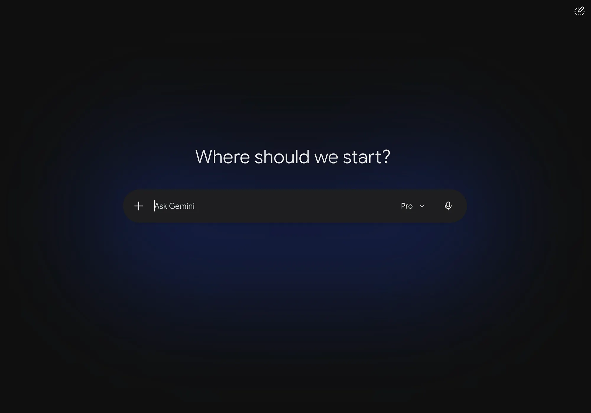
Oh and while I was going through all this, I opened gemini.google.com and that homepage is completely different too. The old layout with all those suggestion chips is gone. Now it’s just a dark background, a soft blue glow, and one input box that says “Where should we start.” And honestly it looks really clean.
So yeah, that’s what Google pushed out this week without telling anyone. Gradients are in now I guess, whether we asked for it or not.
Till then, stay strong and keep learning.
– Rocky